LEARN
How to Use Gestalt Psychology for More Effective UX
A guide to applying visual perception patterns to create clearer interfaces, stronger hierarchy, and more effective UX decisions

Design decisions that feel intuitive aren’t usually just the result of good taste or luck. More often, they’re the result of Gestalt psychology, a set of perceptual principles that summarize how humans process visual information. Understanding these principles makes you a more informed designer and better at defending the decisions that deliver the best experience for your users.
What are Gestalt principles?
The word “Gestalt” is German for “form” or “unified whole”. The theory's foundational claim is that the whole is something other than the sum of its parts.
Gestalt psychology emerged in early 20th-century Germany, developed by psychologists Max Wertheimer, Wolfgang Köhler, and Kurt Koffka. Their central observation was that the human brain organizes visual information into patterns, groups, and hierarchies rather than a collection of isolated parts.
This means your users are reading your interface searching for structure, grouping related things, filling in gaps, and more. The principles that govern that process are called “Gestalt principles.”
Why product designers should care
The human brain processes up to 11 million bits of data each second, with 80% of all sensory data entering through the visual cortex. If you want your customer to stick around long enough to use your platform or purchase your product, it’s best to make that data as easy as possible for them to process.
Disregarding users' perceptual expectations leads to frustrated users, abandoned sites and apps, and lasting damage to brand reputation. The Gestalt principles give designers a practical, research-backed vocabulary for making design decisions that reduce cognitive load and guide users toward the actions that matter.
4 key drivers of Gestalt theory
There are four core perceptual phenomena that explain how the brain organizes what it sees. These phenomena give rise to the Gestalt principles.
Key Drivers | Definition | UX implications |
|---|---|---|
Emergence | Emergence describes how users perceive a whole shape before they notice its parts. A user sees “navigation bar” (the assumed whole) before they see five links with a logo to the left (the parts). | Users form an impression of your layout before they read a word. Global structure needs to communicate intent immediately. |
Reification | Reification is the brain's tendency to fill in missing visual information using familiar patterns. Your users will perceive a complete circle even when it is drawn with a dotted line. | Partial images in a carousel suggest there is more to scroll and a card with a faint border still registers as a distinct container even without a fully rendered edge. |
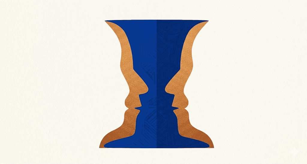
Multistability | Multistability refers to designs that can be perceived in more than one way, depending on where attention first lands. The classic example is the Rubin vase, which alternates between being a vase and two faces. | If a button looks like a label or a section break looks like a border, it can create confusion. When used correctly, it can be effective (like the hidden arrow in the FedEx logo). |
Invariance | Invariance is the brain's ability to recognize an object regardless of rotation, scale, or distortion. | A recognizable icon remains recognizable at 16px or 64px, in both light and dark modes. This is the perceptual basis for icon design. From these four observations about how human minds process visual environments, designers have reached consensus on 11 principles that govern the best UX design. Understanding and implementing them leads to designs that don’t just look good, but can guide users toward the actions they need to take. |
11 Gestalt principles and how to use them in UX
Principle | UX Implementation |
|---|---|
 | Our brains process negative space in such a way that leads us to assume elements are either foreground or background. In UX, this is how you direct attention. A call-to-action button that clearly contrasts with its background is a figure. A modal window that dims everything behind it uses figure-ground to force focus. If figure and ground are not clearly distinct, users struggle to identify what is interactive and what is context. Modal overlays, dropdown menus, and sticky navigation bars all depend on this principle to function. |
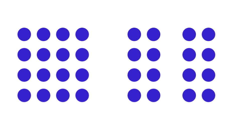
 | Elements that share the same color, shape, size, or typography are perceived as belonging to the same group. This is why all primary buttons in an interface usually look the same. Users instantly recognize related elements through consistent styling, without needing to read the fine print. Similarity also works in reverse: if you want to signal that two elements serve different functions, making them visually dissimilar can be more effective than labeling them. |
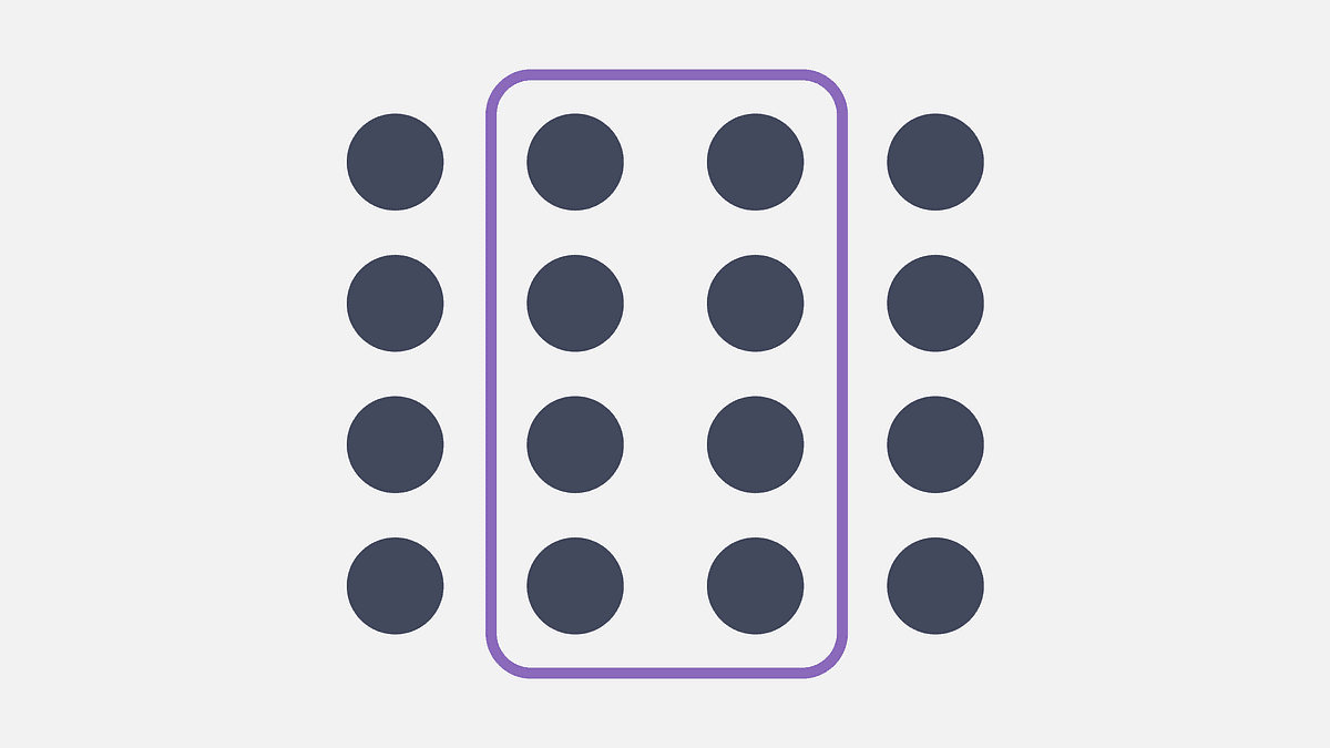
 | Elements placed near each other are perceived as related, regardless of whether they share other visual attributes. It’s important to note that proximity is more potent than similarity or color. In form design, labels positioned directly above or beside their input fields are perceived as a unit with those fields. If you move the label too far away, users make errors. In product listings, proximity groups the image, name, price, and CTA into a single scannable card. Get proximity wrong, and your layout will feel disorganized even if every individual element is designed correctly. |
 | When elements are located in the same closed region, we perceive them as related. Cards are the most common application of this principle in modern UI. A product card, a dashboard widget, and a pricing tier each use an enclosed region to signal “these elements belong together and this unit is distinct from the unit next to it.” Common region and proximity often reinforce each other, but the common region has stronger implications because it draws a literal boundary rather than just implying one through space. |
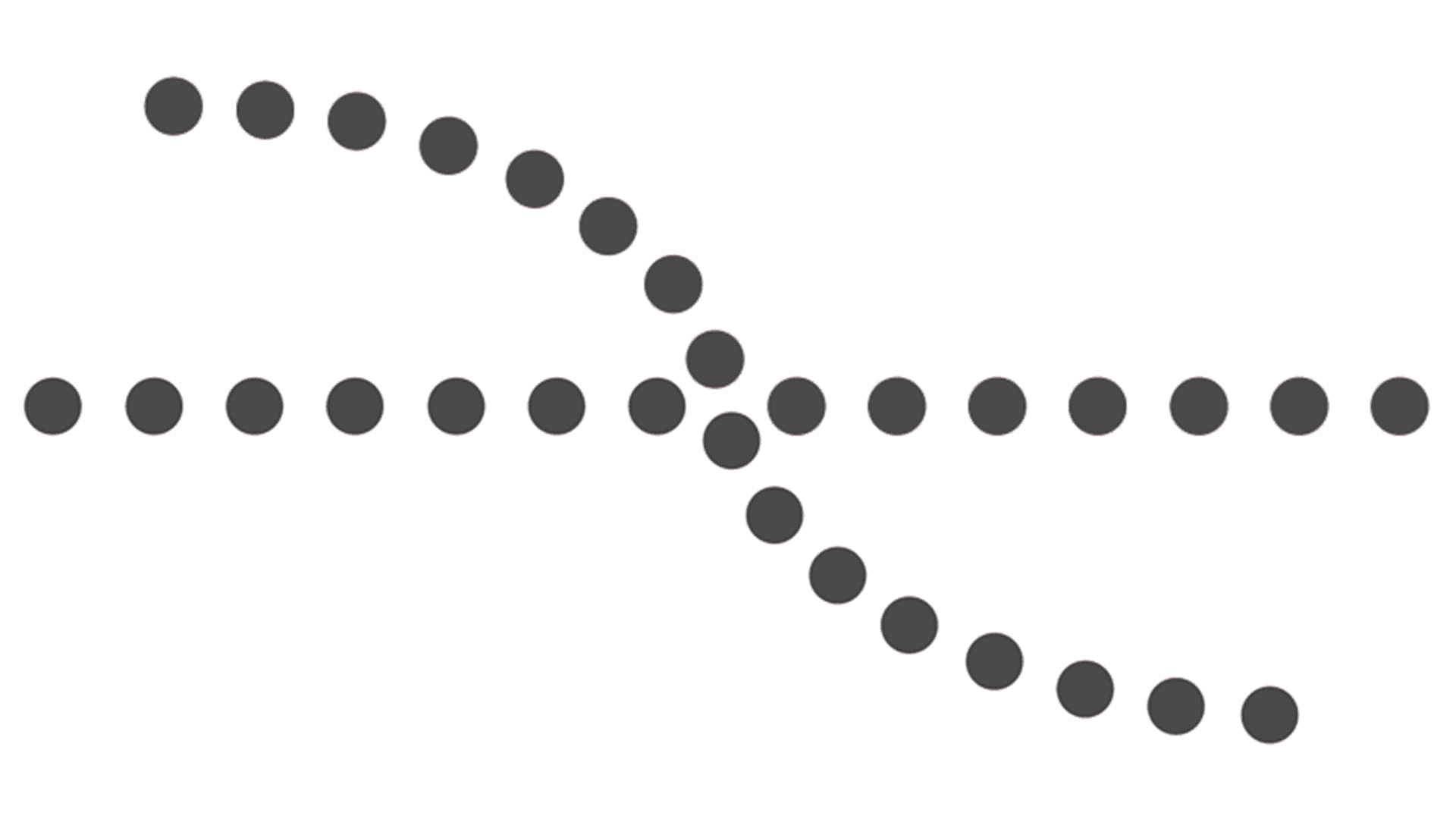 | The eye follows smooth lines and curves more naturally than broken ones, and elements arranged along a line or curve are perceived as more connected than elements arranged at random. Paying attention to continuity while designing your website or app leads users to move through the content without conscious effort. Horizontal scrolling carousels, progress indicators, breadcrumb trails, and stepped onboarding flows all use continuity to signal sequence and direction. When continuity is broken with a jagged transition or an unexpected column change, users register that a new section has started. |
 | The brain fills in missing visual information to perceive a complete shape. We perceive an object as complete even if it is not. We seek closure, filling in missing information to complete a shape. In UX, closure is at work in partially visible elements: a carousel where the edge of the next card is visible signals to users that there is more to scroll. An icon composed of incomplete shapes that the brain completes is more visually interesting and memorable than a fully filled-in equivalent. Logos, iconography, and progress rings all use closure deliberately. |
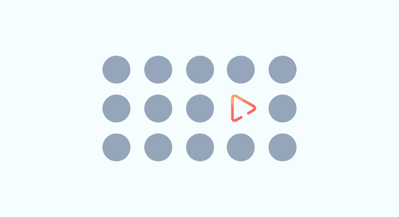 | An element that is visually distinct from its surroundings automatically attracts attention first. Color contrast, size, motion, and white space all create focal points. In UX, the principle is both a tool and a constraint: every layout has a focal point, whether you design one or not. If you do not establish a clear focal point, the user's eye will wander or default to the most visually aggressive element, which may not be the most important. Every page and screen should have a deliberate hierarchy of attention, and the focal point is where that hierarchy starts. |
8. Prägnanz (Law of Simplicity) 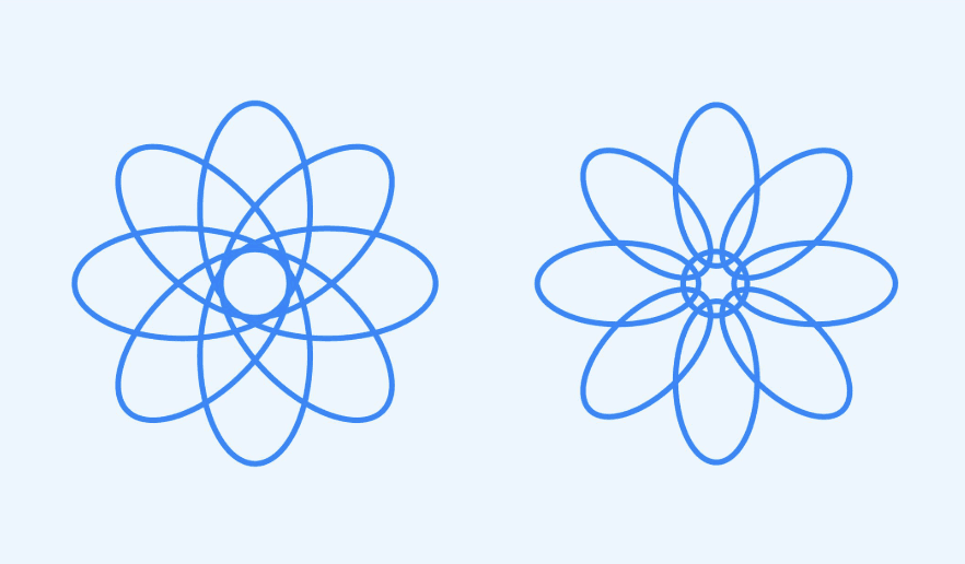 | The brain always prefers the simplest possible interpretation of visual information. When confronted with ambiguity, perception resolves to the most regular, orderly, and symmetrical form available. In UX, Prägnanz is the perceptual argument for simplicity: complex, cluttered interfaces force the brain to work harder and generate more cognitive load. Instead, only show the user what they need at each step. |
9. Symmetry 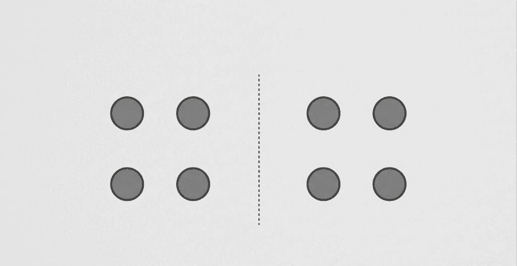 | Symmetrical layouts are perceived as more stable, organized, and trustworthy than asymmetrical ones. In UX, symmetry makes it immediately clear to users how a layout is organized. This does not mean every design must be perfectly symmetrical, but departures from symmetry should be intentional. Asymmetry can create energy and direct attention, but unintentional asymmetry reads as disorder rather than dynamism. |
10. Connectedness 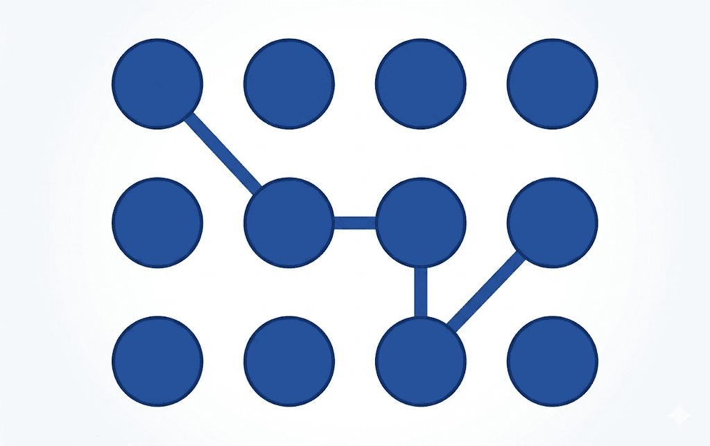 | Elements that are visually connected by a line or a shared background are perceived as more strongly related than elements that are merely close together. In navigation design, this is why active states on tabs often use a connecting underline or background fill rather than just a color change: the visual connection signals the relationship between the tab and the content below it. Connectedness is often the strongest grouping signal available, overriding proximity and similarity when all three are in play. |
11. Common fate  | Elements that move in the same direction at the same time are perceived as a group, regardless of their other visual properties. In static design, this principle is dormant. In interactive designs such as animations, microinteractions, parallax scrolling, and hover effects, it becomes one of the most powerful grouping signals available. When a set of cards shifts simultaneously in response to a filter, users perceive them as a unified system. When elements animate independently and inconsistently, the interface feels unpredictable. |
Testing Gestalt principles in UX with Listen Labs
Understanding Gestalt principles is the first step to creating effective UX design. The next step is to study how your users actually perceive those designs.
Many design teams have skipped that second step because testing visual perception has historically required expensive, slow user research, which they didn’t have the time or resources to execute.
Chubbies, an apparel brand known for its bold, playful shorts, ran into that very problem. Their design team needed to test which visual prints resonated with customers and why, but they were getting back binary survey responses that missed the nuance.

The team turned to Listen Labs to change how they ran visual and wear testing. At Listen, we have created a trusted AI research collaborator that makes deep insights more accessible through qual-at-scale. AI-moderated interviews can run across hundreds of participants instantaneously and surface initial themes to improve the performance of insights teams.
Chubbies customers were able to provide the why behind their visual rankings with Listen, helping the designers brainstorm better ideas in the future. Where a traditional print test ended at a ranking, a Listen-powered study surfaced the perceptual reasoning behind those rankings.
Because Listen Labs records interviewees' videos, customers could wear the product on camera. Rather than reading notes on paper, the design team could hear the customer describe how they felt while wearing the product and see how it fit and moved across a diverse range of body types.
“Being able to see it on actual bodies, on everyone's timeframe, becomes incredibly more helpful,” Lauren Neville, Director of Insights and Innovation, said.
The results were significant: a 24x increase in research participation from the young demographic they were targeting and market validation 6x faster than traditional methods.
Between Gestalt-informed design decisions and a qual-at-scale research platform to validate your assumptions about your audience, your UX will be better received, leading to more conversions and happier customers.
Frequently asked questions
What are Gestalt principles in UX design?
Gestalt principles are a set of psychological laws that describe how the human brain organizes visual information into patterns and wholes. In UX design, they explain why certain layouts feel intuitive and others confusing, and they give designers a practical framework for making decisions about grouping, hierarchy, contrast, and visual flow that align with how users actually perceive interfaces rather than against them.
What is the most important Gestalt principle for UX?
There is no single most important principle, because they work in combination. That said, proximity and figure-ground are the two that most directly affect usability. Proximity determines whether users perceive related elements as belonging together. Figure-ground determines whether users can distinguish interactive elements from context. Without effectively applying those, the interface can make usability close to impossible, regardless of how well other principles are applied.
How do Gestalt principles apply to mobile UX?
On smaller screens, Gestalt principles become more constrained and therefore more consequential. Proximity must work harder because there is less spatial separation between elements. Common region is more frequently used to create distinct content containers within a limited vertical space. The focal point is critical because there is rarely room for more than one strong visual anchor per screen. And continuity governs how users understand swiping, scrolling, and gesture navigation as directional cues rather than arbitrary interactions.
How do you test whether Gestalt principles are working in your design?
The most direct method is moderated usability testing, which is observing users as they interact with the interface and noting where their attention goes, where they hesitate, and where they make errors. For visual designs (print, packaging, marketing materials), qualitative interviews that ask users to describe what they notice first, what feels related, and what feels confusing will surface Gestalt misalignments. Eye-tracking studies, when available, also provide behavioral evidence of where attention actually lands.