Written by: Anish Rao, Head of Growth, Listen Labs
Key Takeaways
- Most research teams excel at data collection but struggle to turn findings into clear executive narratives, which creates confusing “data dump” decks that slow decisions.
- A repeatable seven-step workflow moves teams from study objectives to polished presentations within the target timeline without sacrificing rigor.
- Success depends on clarifying objectives first, synthesizing findings into a single “So What” narrative, and limiting the main deck to ten slides or fewer.
- Each slide should deliver one idea with a declarative title, supported by a single visual or verbatim quote, while methodology details live in the appendix.
- Listen Labs automates the full research-to-presentation cycle for enterprises like Microsoft and Procter & Gamble. See how the platform compresses your research timeline.
Step 1: Clarify the Decision, Stakeholders, and Beliefs
Weak research presentations usually start in PowerPoint before three basics are clear: the decision, the audience, and their existing beliefs.
Before opening any design tool, write the decision point in one sentence, list every stakeholder who will receive the deck, and note any assumptions those stakeholders already hold. In a CPG context, this might read: “The VP of Innovation needs to decide by Thursday whether to advance the oat-based protein bar concept to a consumer test, or kill it. She currently believes the concept skews too young.”
This level of specificity, with one decision, one stakeholder, and one belief, determines which findings belong in the main deck, which belong in the appendix, and which can be omitted entirely. Objectives-first discipline supports every later step in the process.
Step 2: Turn Findings into a Single “So What” Story
Raw findings sit at the surface. An insight connects a finding to its implication for the decision at hand. The fastest way to move from data to insight uses an inverted pyramid: lead with the conclusion, then support it with evidence.
A Stanford classroom experiment cited in Made to Stick found that 63% of audiences remembered stories while only 5% remembered individual statistics, which is roughly 12 times more recall for stories. Research decks benefit from the same effect when findings appear as a narrative instead of a disconnected list.
The ABT framework (And-But-Therefore) provides a fast way to synthesize. In a tech context: “Users value the onboarding experience, but 68% abandon the flow at step three, therefore the product team should prioritize a single-screen setup redesign before the Q3 launch.” That one sentence becomes the narrative spine for the entire deck.
Once the spine exists, run a quick prioritization pass. Rank every finding by how directly it informs the decision. Findings that shape the decision belong in the main deck. Everything else moves to the appendix.
Step 3: Build a Ten-Slide Skeleton That Matches How Leaders Decide
Slide count signals clarity. A 40-slide deck usually reflects transcription, not synthesis. Aim for ten slides or fewer in the main narrative, using a simple Problem, Findings, Insights, Recommendations flow.
Guy Kawasaki’s 10-20-30 rule, which uses ten slides, twenty minutes, and thirty-point minimum font, remains a reliable constraint for executive audiences. The font rule helps most. When a finding needs small text to fit on one slide, the idea has not been distilled enough.
In a retail context, this skeleton prioritizes findings before synthesis because retail executives often want to see the evidence trail before they accept recommendations. A ten-slide structure might run: (1) Study objective and decision context, (2) Methodology summary, (3) Key finding one, (4) Key finding two, (5) Key finding three, (6) Synthesized insight, (7) Segment breakdown, (8) Competitive implication, (9) Recommendations, (10) Proposed next steps. Every slide after ten moves to the appendix.
Step 4: Use One Idea per Slide with Clear, Declarative Titles
Each slide should carry a single idea. The title should state that idea as a complete, declarative sentence instead of a vague topic label. “Consumer Attitudes” is a topic. “Consumers under 35 prioritize sustainability over price when choosing a new snack brand” is an insight title.
When every slide title works this way, executives can scan the narrative in under 90 seconds by reading titles alone. Paul Zak’s research published in Harvard Business Review shows that character-driven stories with tension increase attention, empathy, and cooperation. Slide titles that carry narrative tension, rather than neutral labels, tap into the same effect.
This discipline also forces synthesis. When a slide title cannot be written as a single declarative sentence, the underlying finding still needs interpretation.
Step 5: Support Each Claim with One Visual or One Verbatim Quote
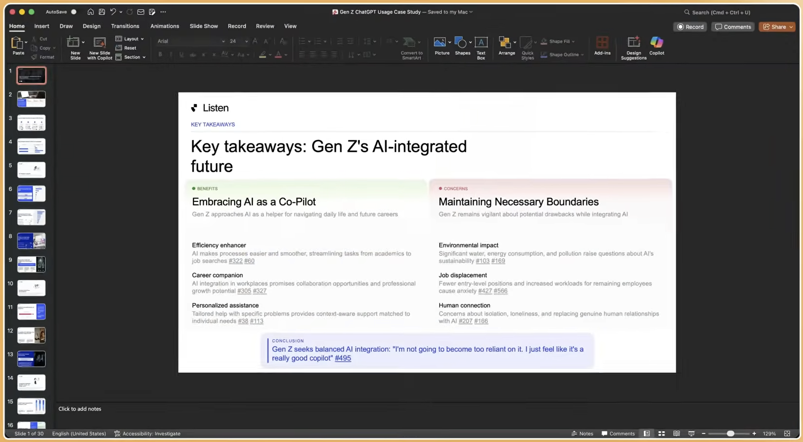
Support your slide’s claim with one piece of evidence: a chart, a statistic, or a verbatim quote from a participant. Not three charts. Not a chart plus two quotes. One clear anchor.
Structured data storytelling transforms raw numbers into simplified, narrative-driven visuals such as funnels or progressive bar charts, providing context and flow so decision-makers can grasp insights quickly. The visual should stand on its own with help from the title. When the presenter must explain what the chart means, the visual is not pulling its weight.
Verbatim quotes work especially well for qualitative findings because they carry emotional weight that paraphrased summaries lose. A single quote such as “I felt like the app was designed for someone else” communicates a usability failure more memorably than a statement that 54% of users reported low task confidence.
Behavioral or emotional data, such as facial expression analysis or tone-of-voice signals, can deepen this evidence. A simple overlay annotation on the visual, such as “confusion peaked at this moment,” adds a layer that self-reported data alone cannot provide.
Step 6: Use an Appendix as the Credibility Layer
Executives need fast, scannable decks. Methodologists need transparency and detail. A well-structured appendix satisfies both groups.
Move every piece of supporting evidence that does not belong in the main ten slides into the appendix. This includes screener criteria, sample composition, statistical significance tables, full crosstabs, and extended verbatim sets.
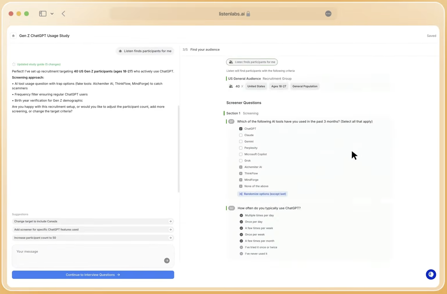
The appendix should feel intentional, not like an afterthought. It acts as the credibility layer that keeps the main deck clean. When a skeptical stakeholder asks “how many respondents said that?”, the answer lives in the appendix, not on slide six.
Label appendix slides clearly and reference them from the relevant main-deck slides. This structure lets the presenter jump to details during Q&A without searching or breaking the narrative flow.
Step 7: Rehearse and Adjust Delivery for Each Audience Type
The same deck needs different delivery styles for executives and working teams. For an executive audience, lead with the recommendation, spend most of the time on implications, and treat findings as supporting evidence. Executives focus on decisions, not methodology walkthroughs.
For a working team of product managers, designers, or brand managers, the findings themselves become the main content. These groups need enough detail to act on the research independently, so the presenter should spend more time on the data and less on the high-level recommendation.
The Situation-Complication-Resolution (SCR) framework mirrors how executives think: where things stand, what changed or is at risk, and what decision comes next. Structuring the spoken delivery around SCR, even when the slides follow a different visual order, keeps executive audiences oriented.
Rehearse the executive version to a 15-minute target. When the deck cannot be presented in 15 minutes, the story still needs more distillation.
Even with a disciplined seven-step process, teams encounter recurring obstacles that threaten the target timeline. The next section highlights the most common challenges and how to address them.
Common Challenges and Troubleshooting
Unclear objectives produce unfocused decks, which show up as presentations that try to answer too many questions at once because the team never aligned on a single decision. When you see this signal, return to Step 1 and force a single decision-point statement before moving forward.
Low-quality respondents produce findings that stakeholders distrust, often surfacing as pushback such as “I’m not sure our customers actually think that.” This skepticism usually reflects sample contamination from professional survey-takers or poorly matched participants. The remedy is rigorous participant verification at recruitment, using behavioral matching, real-time fraud detection, and frequency limits that keep these issues out of the sample.
Analysis bottlenecks appear when teams handle synthesis manually across hundreds of interview transcripts. AI-assisted analysis that processes all responses at once, identifies themes and outliers, and reduces human bias removes this bottleneck and cuts synthesis time from days to minutes.
Stakeholder misalignment arises when different teams interpret the same findings in conflicting ways. Involving key stakeholders in the objectives-setting work in Step 1 creates a shared frame for the research before data collection begins, which reduces these clashes later.
Measuring Success of Your Presentation Workflow
Three objective indicators show whether a research presentation workflow is working: study cycle time, stakeholder usage rate, and downstream decision impact.
Study cycle time, measured from brief to delivered deck, is the easiest to track. A workflow that consistently delivers executive-ready decks within the target timeline, compared with an industry norm of four to six weeks, creates a clear competitive advantage for the research function. Teams that track this metric can show the value of research infrastructure in concrete terms.
Stakeholder usage rate requires a simple tracking mechanism. Use a shared log where the presenter records whether each deck resulted in a decision, a follow-up request, or no action. Over time, this log reveals which presentation formats and narrative structures drive the highest decision rates, allowing the team to double down on high-performing structures and retire formats that rarely move stakeholders.
Advanced Presentation Strategies for Complex Programs
Always-on research programs need presentation infrastructure that scales beyond single studies. Instead of building a new deck for every project, teams running continuous research should maintain a living dashboard that updates as new findings arrive, using a consistent narrative structure that stakeholders can navigate without a presenter.
Global multi-market studies add the challenge of regional variation while still requiring a single overarching “so what.” A tiered deck structure solves this. Create a global synthesis deck for executives, then attach market-specific appendices for regional teams. Automatic translation and transcription across languages, available in platforms that support 100+ languages, remove the manual localization work that usually adds days.
Behavioral and emotional data adds depth that self-reported findings cannot match. Multimodal signal analysis, which covers tone of voice, word choice, and facial micro-expressions, surfaces emotional responses that participants never state directly. Presenting this data alongside verbatim quotes gives executives a fuller view of consumer sentiment and increases confidence in the recommendations.
Frequently Asked Questions
How long should a market research presentation be for an executive audience?
Keep the main deck to ten slides or fewer, with a target presentation time of 15 minutes. Apply the 10-20-30 rule described in Step 3: ten slides or fewer, with a concise delivery that respects executive time. Everything beyond ten slides belongs in the appendix. Executives make decisions based on synthesized insights, so brevity becomes a strength rather than a limitation.
What is the fastest way to go from raw interview data to a finished presentation?
The synthesis step usually creates the biggest delay because teams manually review transcripts, identify themes, and draft findings. AI-assisted analysis platforms that process all interview responses at once can compress this work from several days to under an hour. Listen Labs’ Research Agent, for example, generates automated key findings, themes, and one-click slide decks directly from interview data, which lets teams move from completed interviews to a finished deck within the target timeline.
How do you handle conflicting findings across different audience segments?
Conflicting findings signal meaningful segmentation. They show that different groups value different things. Present the conflict clearly in the main deck, such as “Segment A prioritizes price; Segment B prioritizes convenience,” and frame the recommendation around the segment the business plans to target. Avoid averaging conflicting findings into a single number, which hides the strategic insight.
How do you maintain methodological credibility while keeping the main deck scannable?
The appendix carries most of the methodological detail. The main deck should state sample size, methodology type, and fieldwork dates on a single summary slide, usually slide two, then move into findings. Full screener criteria, sample composition tables, statistical significance thresholds, and extended verbatim sets all live in the appendix, referenced from relevant main-deck slides so they remain accessible during Q&A without cluttering the story.
Can non-researchers use this framework independently?
Non-researchers can apply this framework when they have the right tools. The seven steps are designed for anyone who can define a decision point and an audience. AI-assisted platforms now handle study design, moderation, analysis, and deck generation, which covers the parts that once required deep research expertise. Product managers and brand managers at companies without dedicated research teams can run end-to-end studies and receive presentation-ready outputs without becoming methodologists.
Conclusion: Turn Research into Decisions on a Reliable Timeline
The seven-step workflow, which clarifies objectives, builds a single narrative, uses a ten-slide skeleton, applies one-idea-per-slide titles, pairs each claim with one visual or quote, adds a methodology appendix, and tailors delivery by audience, creates a repeatable system for turning raw research into executive-ready presentations at the speed your business needs.
The data-dump problem reflects process gaps, not talent gaps. Teams that adopt this workflow, and pair it with AI-assisted research infrastructure that compresses synthesis and delivery, remove the backlog that slows product cycles and frustrates stakeholders.
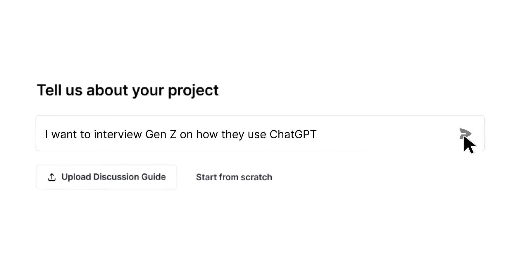
Listen Labs supports the entire research lifecycle, from AI-assisted study design and global participant recruitment across a 30M-person verified network, to AI-moderated interviews, automated analysis, and one-click generation of consultant-quality slide decks. Enterprises including Microsoft, Procter & Gamble, and Skims use the platform to deliver research at the pace their decisions require.
See the 24-hour research-to-presentation workflow in action.